Skip to content
HubSpot
Our certified experts help you use HubSpot to power growth with automation, data insights and AI.
Ethical Digital Marketing
Join our community of digital marketers learning how to use their values as their marketing superpower.
Inbound Marketing
Campaigns, SEO, social media and content that builds your audience and creates qualified leads.
Digital Sales
AI tools, automation and data-informed insights for better prospecting and lead nurturing.
Creative Content
Web pages, blogs, graphic design, webinars and videos that educate and inspire your audience.
Account based marketing
Win work faster, from high-value customers with marketing tactics tailored for sales.
The Beginners guide to generating Inbound Leads - menu-1
Want to learn the secrets of lead gen? Download our free guide now. 
Looking for Data training and consultancy?
KWS_0414
About us
We are a specialist data literacy & digital marketing consultancy.
Blogs
Discover quick tips, innovative insights, and fresh ideas to inspire your mission.
Events & Webinars
Join us to expand your knowledge and forge valuable connections.
Guides & Tools
Free resources that help you put responsible marketing into action.
Keep up to date with all of our latest blogs, events, webinars and new content
Pantone colour charts printed out and laid on a table.
Candice Bullmore21/9/2023 00:07 AM1 min read

Create an accessible colour palette in seconds

Any conscious marketer will care about making their brand accessible. But it's not easy to know where to start, even when you know that designing for accessibility benefits your entire audience.

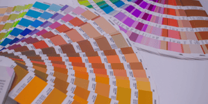
An accessible colour palette means anyone with visual impairments and disabilities can see and understand your design. Contrast is key to achieving this goal. Elements with low contrast are hard to see, even for those without visual impairments.  

Don’t fret - we’ve done the heavy lifting for you! In this little mission, we suggest trying the free Accessible Colour palette generator from Venngage to generate your own accessible colour palette in literally seconds! The best bit - you can rest assured that:

  • It follows Web Content Accessibility Guidelines (WCAG).
  • The pairings have sufficient contrast for use with normal text, large text and graphics.
  • It ensures all pairings will have a contrast ratio of at least 4.5:1 per WCAG 2.1
  • It will save you a ton of precious time!

Get your palette in one of two ways:

  • Generate from HEX: Pop in your own HEX code if there’s a colour you want, and you’ll be served a bunch of lovely accessible palettes based on your colour of choice.
  • Randomise: Luck of the draw with this one, Roll the dice, and it generates palettes based on a random colour.

Have fun! And rest easy at the same time. 

Found this Little Missions interesting?

Subscribe to get Little Missions delivered straight to your inbox.


avatar

Candice Bullmore

Candice has a background in sales and learning. And, a passion for helping people develop new skills. She led the launch of Mission Drive as a Hubspot Partner Agency and leads the development of the data skills programmes we design for clients. Candice has overall responsibility for our leadership products, connections with partners, and project delivery.

RELATED ARTICLES